UX + Content Design

Hinge paywall
Updates to the Hinge paywall for Hinge+ and HingeX; 2023/224
In February 2023, Hinge released two new subscription tiers: Hinge+ and HingeX. As this work was in-flight when I joined the company, I wasn’t initially owning all copy - but closer to launch, I wound up as the writer responsible for all UX copy/content design decisions, including subscriber benefits, upsells, banners, half-sheets, and more, all aimed at converting free or (FKA) “Preferred” members to paid plans, without being heavy-handed, of course. It involved a ton of research, product-naming decisions, and microcopy.
Results: We immediately saw a substantial uptick (specifics of which can’t be disclosed publicly!) in subscriptions - soon followed by resubscribers, which proved it wasn’t merely a novelty effect - of both tiers; not a lot of subscriptions would’ve been required to make a noticeable business impact, but it exceeded some projections. Based on the use cases, touchpoints people were subscribing from, and UXR we saw pre-launch, it’s safe to say that the copy helped nudge and/or directly lead to users purchasing subscriptions.

Siri Dialog, Apple
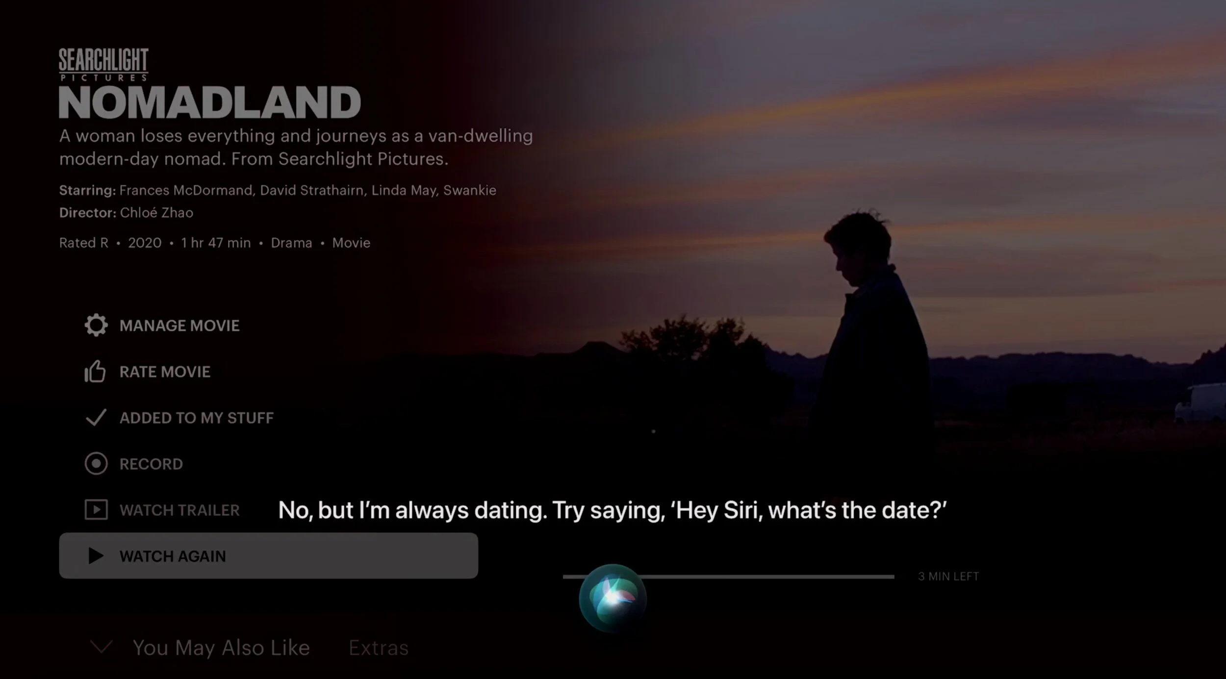
Example of dialog I wrote for Siri; December 2019 (captured in 2021 on Apple TV).
I focused largely on the “Sensitive Topics” domain as a writer for Siri: What happens when users ask Siri the non-softball questions (or make a statement along the same lines)? Tons of thought, research, and rounds of approvals went into each piece of dialog I wrote - as well as the overall experience and design. And each platform or device, of course, required a different response. On Apple TV, for example, challenge was always different from that of the iPhone, Apple Watch, or screen-free HomePod.
Results: These types of responses were carefully designed with discoverability in mind for users looking to engage - but intended to shut down users with more negative intent.

Siri Dialog, Apple
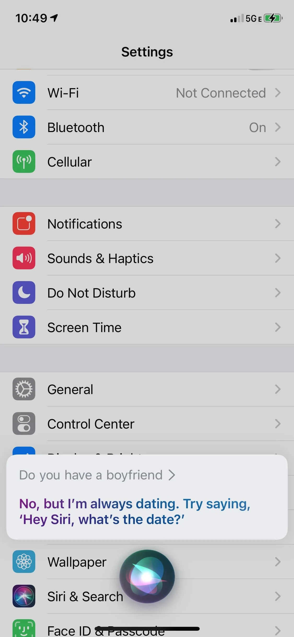
Same example of Siri dialog but on iPhone; December 2019.
Working on Siri dialog was always an exercise in content design - being mindful of each unique user-invocation surface and how that might impact the experience.

Siri Dialog, Apple
Another example of dialog I wrote for Siri; April 2019.
While it may not always be apparent to users, so much goes into deflection responses like this - predicting potential follow-ups or prevent them, while trying to stay “on-brand” for Siri.

Siri Dialog, Apple
Another example of dialog I wrote for Siri; October 2019.
Proud to have worked on the most sensitive questions, like this one, and designed an empathetic experience. The response to this was previously vastly different, but with a goal of helping anyone who was asking this or similar questions, I was able to land on something that struck a balance - while co-designing a rare (at the time) “multi-turn” experience. Dialog like this always involved many different proposed directions and approvals, as well as a new content audit or revisiting a recent one to ensure personality consistency.

Facebook glasses (Ray-Ban Stories)
Companion app for Facebook’s smart glasses with Ray-Ban; Oct. 2020 (product launched Sept. 2021).
Worked on settings, product naming, and out-of-box UX for Facebook’s co-branded Ray-Ban Stories. One of the challenges was the lack of hardware precedence at Facebook (primarily Oculus and Portal at the time), so there weren’t long-held guidelines, outside of the Facebook family-of-apps voice. It was largely up to me to take a PM’s raw list of settings and turn that into a Facebook-branded settings experience for this first-of-its-kind product at the company - in addition to working on product naming and the OOBE for Stories.
Results: All in-app copy was based on UXR insights and addressed potential user friction from a trust-and-safety perspective; we also wanted to ensure people could use their hardware seamlessly right out of the box, and based on metrics from CX and others post-launch, the copy accomplished that.
![Facebook glasses (Ray-Ban Stories) [cont'd]](https://images.squarespace-cdn.com/content/v1/58de5ada1e5b6c41e0e26be9/1631484747366-1EOA6JSU8OA48Q60D6XP/image-asset.png)
Facebook glasses (Ray-Ban Stories) [cont'd]
Primary focus was on app settings/IA - but as one of a lean team of content designers on this project, working with a similarly lean team of product designers, we each stepped outside of our lanes, to say the least. Settings challenges included lead times required for reviews and reviews as a new product category and factoring in lots of UXR that often required 11th-hour pivots on small and large scales.

Spotify Greenroom launch
In-app intro, Anchor → Spotify Greenroom; June 2021.
Spotify officially launched a live-audio app in 2021, closely tied to both the Spotify app and Spotify’s podcasting platform, Anchor. I worked on the in-app UX for the latter, from a top-nav-banner entry point to the resulting full-screen takeover, which ultimately drove to the app download.
Results: Spotify Greenroom (before it was known as Spotify Live) has since been sunsetted, but at launch, this experience helped onboard thousands of creators to experiment with a net-new product. We expected tons of CX inbounds based on the novelty of Greenroom and integration with Spotify and Anchor - but were pleasantly surprised by the lack thereof.

Shazam AR product flow
Wrote all in-app copy and helped with content design for Shazam's launch of augmented reality; March 2017.
This was Shazam’s first foray into AR and marked a pretty big departure for a product largely known as the music-identification app. Challenges involved explaining the perceived pivot to users in limited screen real estate - and designing the flow, while keeping it all very light on text.

Shazam's 'Discover' launch
New in-app feature, 'Discover’; August 2017.
Launched with copy-heavy UX components and on-boarding throughout, this was a big value add at the time for users accustomed to a utilitarian app experience. Users were able to get regular music recommendations based on their Shazaming behavior. I deciphered lots of high-level PM descriptions of this feature and turned it into an interactive ‘card’-based experience for users.

Shazam GDPR
Copy (web and mobile) for a custom landing page and interactive experience around the EU’s General Data Protection Regulation (GDPR) mandate; May 2018.
This was a big launch for Shazam - then a European-headquartered company - in compliance with sweeping data-rights changes in the EU. We (copy and PM) needed to build a custom educational and actionable page on web and mobile to let impacted users self-remediate. Lots of thought went into the experience and interactivity.

Beat Shazam play-along game
'Beat Shazam' play-along experience and in-app game. Launched with premiere of new FOX series of the same name; heavy copy component throughout the in-app experience; May 2017.