01
Netflix · 2025 · UX + content design
Shipped
Reworking Netflix's front door: the non-member home page
A full redesign of the flow everyone who isn't yet a Netflix member (or who is a logged-out member) sees first, where each word is measured against sign-ups.
RoleSole content designer
PartnersProduct design, PM, UXR, localization
ScopeValue props, plan comparison, sign-up entry points, legal-adjacent copy
SurfacesiOS/Android, mobile web, in-app
The problem
The flow had become stale from years of dormancy. It explained the business instead of making a compelling case, and the same value prop appeared in different voices depending on where you landed.
What I did
- Audited every non-member surface and mapped where the message broke
- Worked on a library of value props to be circulated companywide and ensure coherence
- Set terminology for plans and pricing that legal and growth both signed
- Directed the copy through UXR rounds and localization review
Outcome
Sign-up conversion moved in both testing and the product, and the terminology set here became the default for downstream commerce surfaces.
MORE THAN AN UPDATE
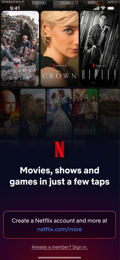
Current
Clean, clear, less swiping, more actionable
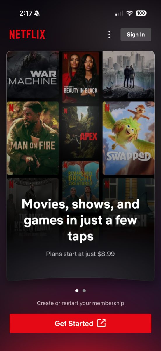
- Just two screens to scroll through
- Clear hero headline
- Price info
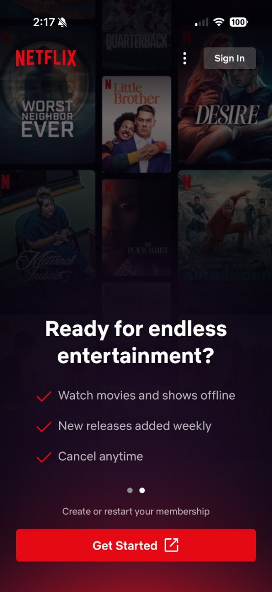
- Clear value propositions
- Data-backed
- Fits on a single line
Where it started
Outdated language, look, feel, and interaction
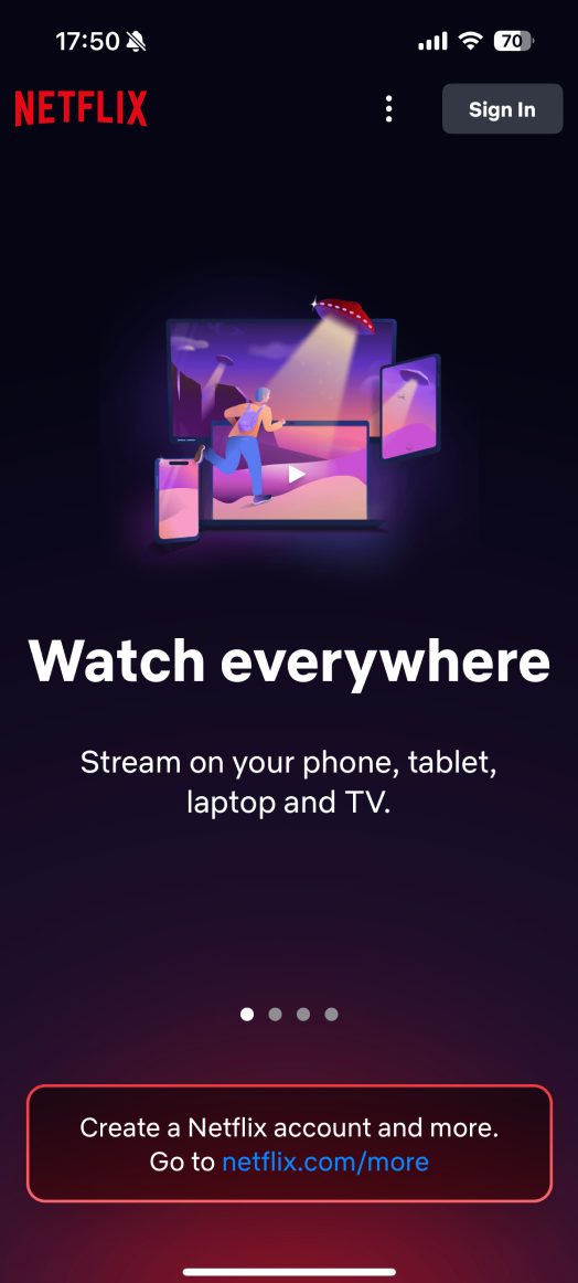
Four scrolls just for value props, each with their own headline
Explorations
Detailed plan view, an entirely different presentation of value props, and other explorations
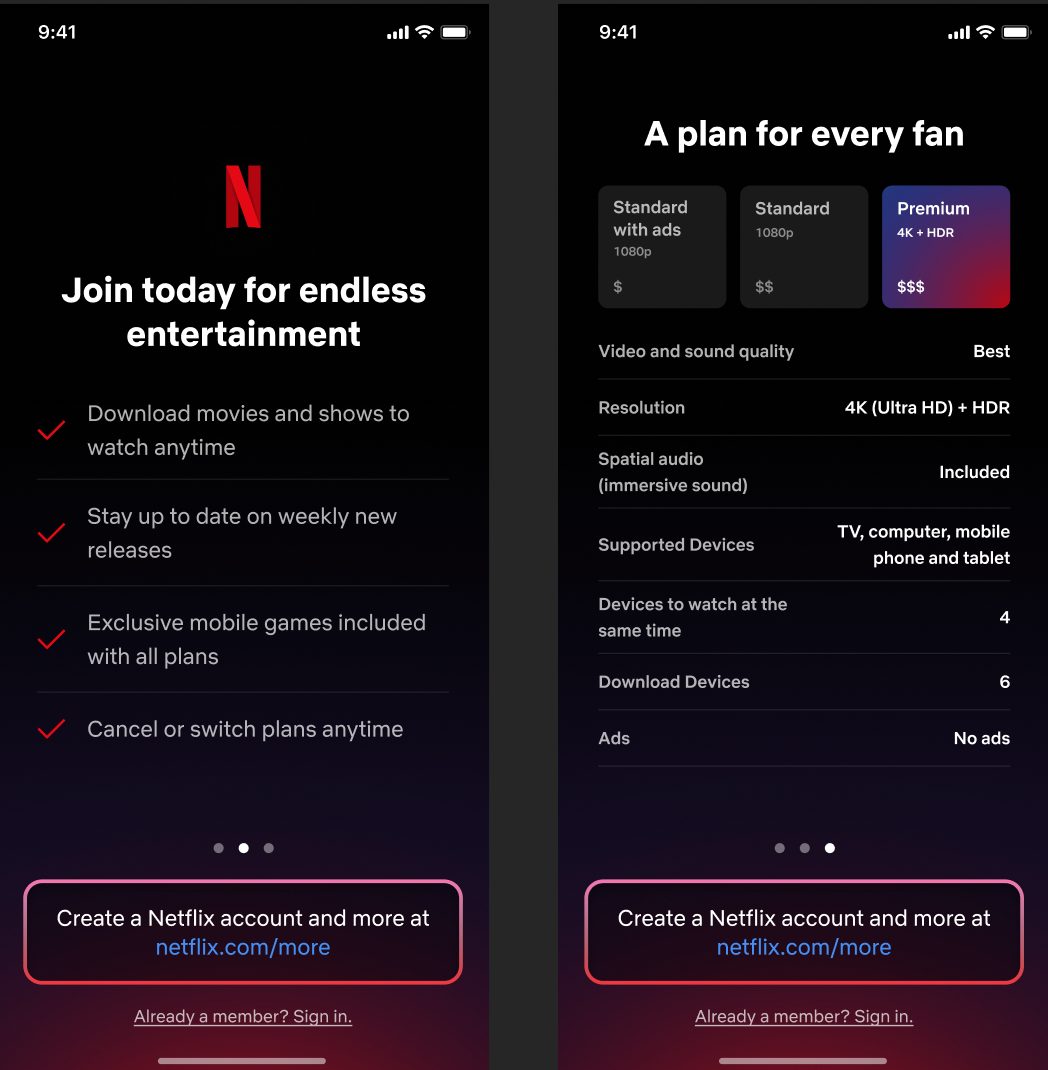
I explored different value-prop combinations and interfaces; ultimately, I hypothesized and got confirmation that one was too much info and the other too little.
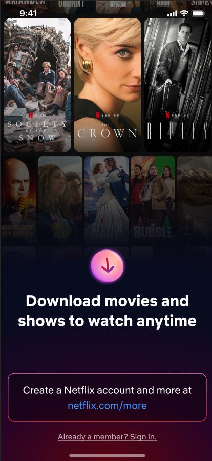


Rotating value props